OH REELLLYY

Mitten Produce is a Michigan-based wholesale produce operation that sources from leading national farms and moves it to the food service companies, distributors, and institutional buyers who feed everyone else. Their business runs on two things: grower relationships and straight talk. The brand needed to match.


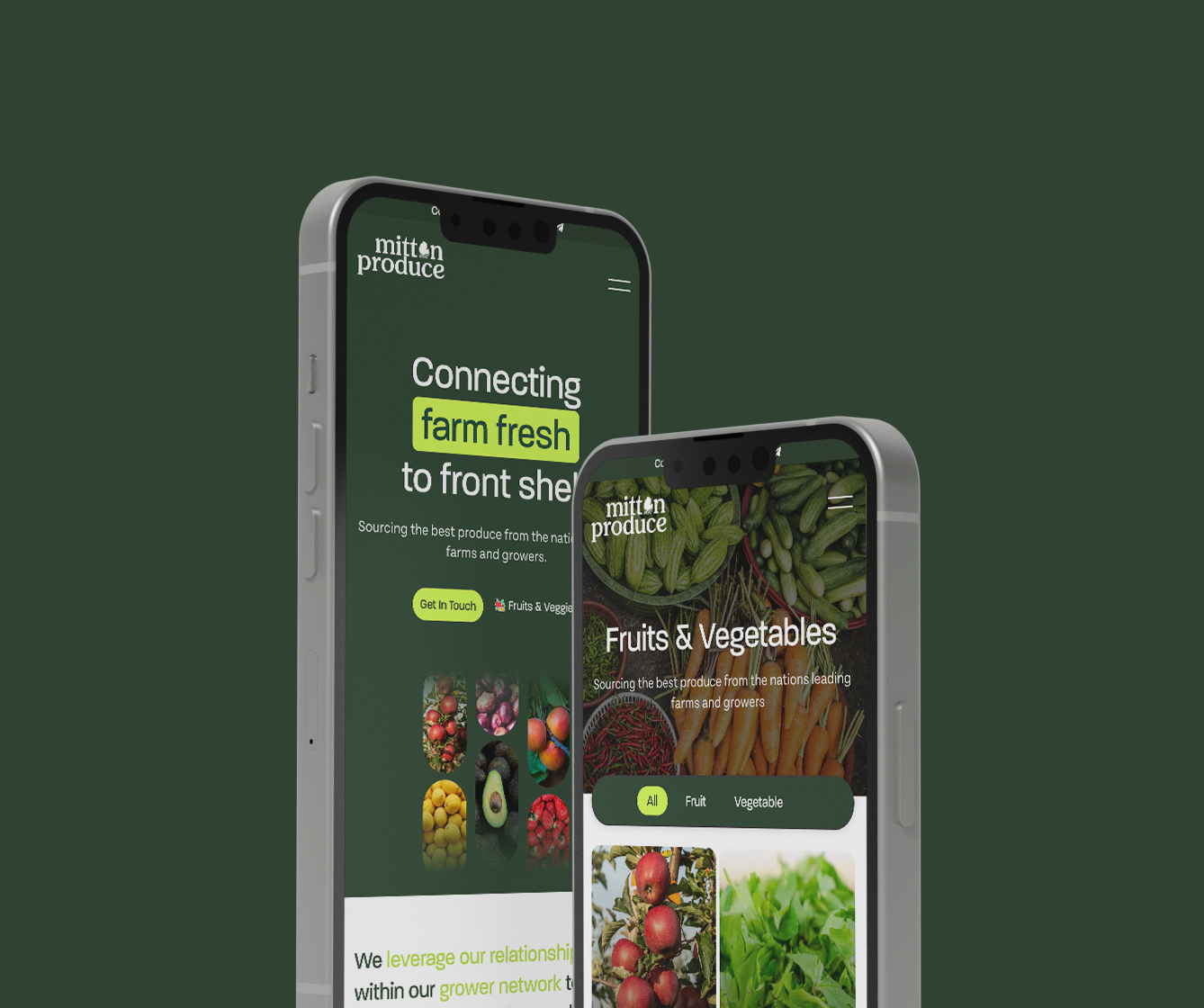
The name is the hook — “mitten” is how Michiganders point to their own state. We built the identity around that. The logo pairs a clean geometric mark with a modern sans-serif wordmark, designed to read at truck-trailer scale and at thumbnail size. The palette keeps it confident and appetite-forward: a deep produce green, crisp white, and a warm accent for highlights. No stock-photo gradients, no overworked illustration — just a mark that looks as serious as the operation behind it.
The site is built to close a sale in one page if it needs to. The hero leads with the tagline — connecting farm fresh to front shelf — and the 3-step sourcing process sits directly below it, so a new buyer understands how Mitten works before they even scroll to the catalog. From there the produce grid gives quick access to 25+ commodities without making anyone dig.
A brand and site that feel like the Mitten Produce the team actually is — direct, relationship-driven, and built on trust. The identity flexes from a business card to the side of a pallet, and the website gives buyers everything they need to pick up the phone.