OH REELLLYY
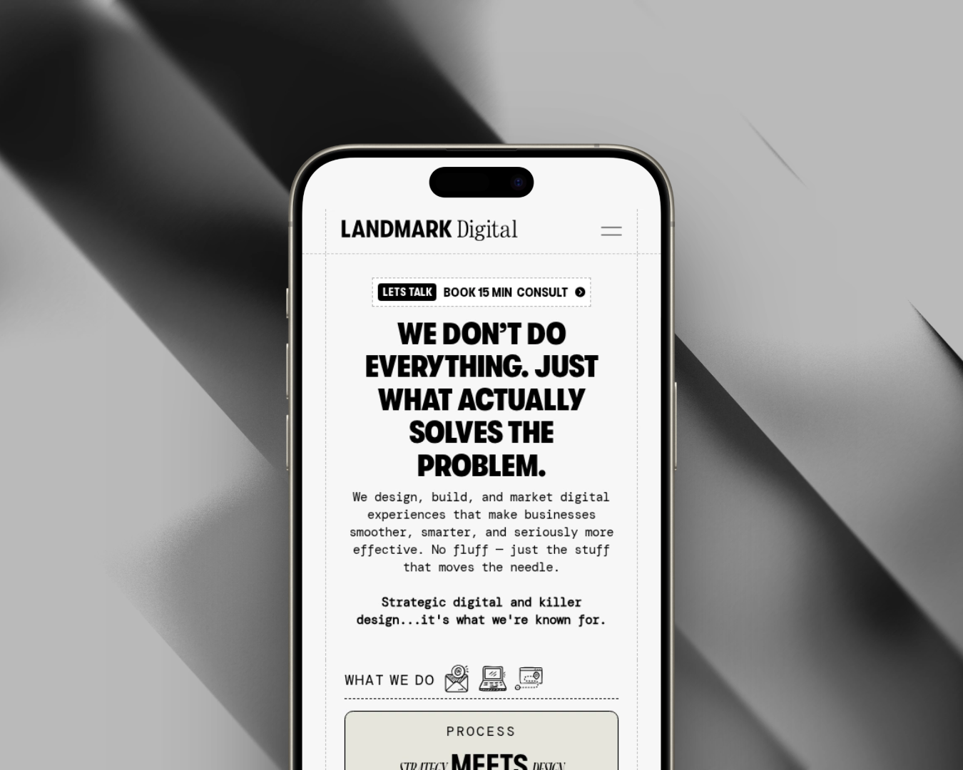
Landmark Digital doesn’t call itself an agency. They’re a small, opinionated studio that pairs digital strategy with design and engineering — then stops there. No bloat, no ten-person account teams, no decks for the sake of decks. Our job was to build the brand and the platform that make that positioning impossible to miss the second someone lands on the site.
Landmark’s voice is the product: confident, a touch irreverent, allergic to fluff. We built an identity that lands the same way. The wordmark is a modern, high-contrast sans serif with a custom “landmark” glyph that doubles as an app icon and social avatar. The color system is tuned for full dark and light mode parity — no retrofits, no one-off overrides — and the whole kit is built to stay crisp on hero mockups, pitch decks, and export-to-social alike.
The brief was to let the site do the selling. The homepage walks a visitor through Landmark’s three-phase process — Discover & Strategize, Design & Build, Launch & Scale — then hands off to real work and a real team, not stock imagery. Every decision is pointed at the same outcome: a qualified lead reaches the contact page already knowing how Landmark works.
The site ships as a lightweight, component-driven build — fast on first paint, easy for the Landmark team to update, and ready to slot in new case studies without touching code. The same design tokens drive marketing pages, the blog, and the Landmark Maps product surfaces, so the brand stays consistent as the platform grows.
A brand and platform that back up Landmark’s positioning in the first three seconds on the page. The studio feels as sharp as the work they ship, the process is legible before a buyer ever fills out a form, and Landmark Maps finally has a home that does the product justice.